TypeFace
brand identity
the brief
TypeFace sells notebooks, pens, and desk accessories built around the idea of slowing down and writing by hand. The brand needed to feel nostalgic without looking dated, and confident enough to hold its own next to modern stationery brands online.
the approach
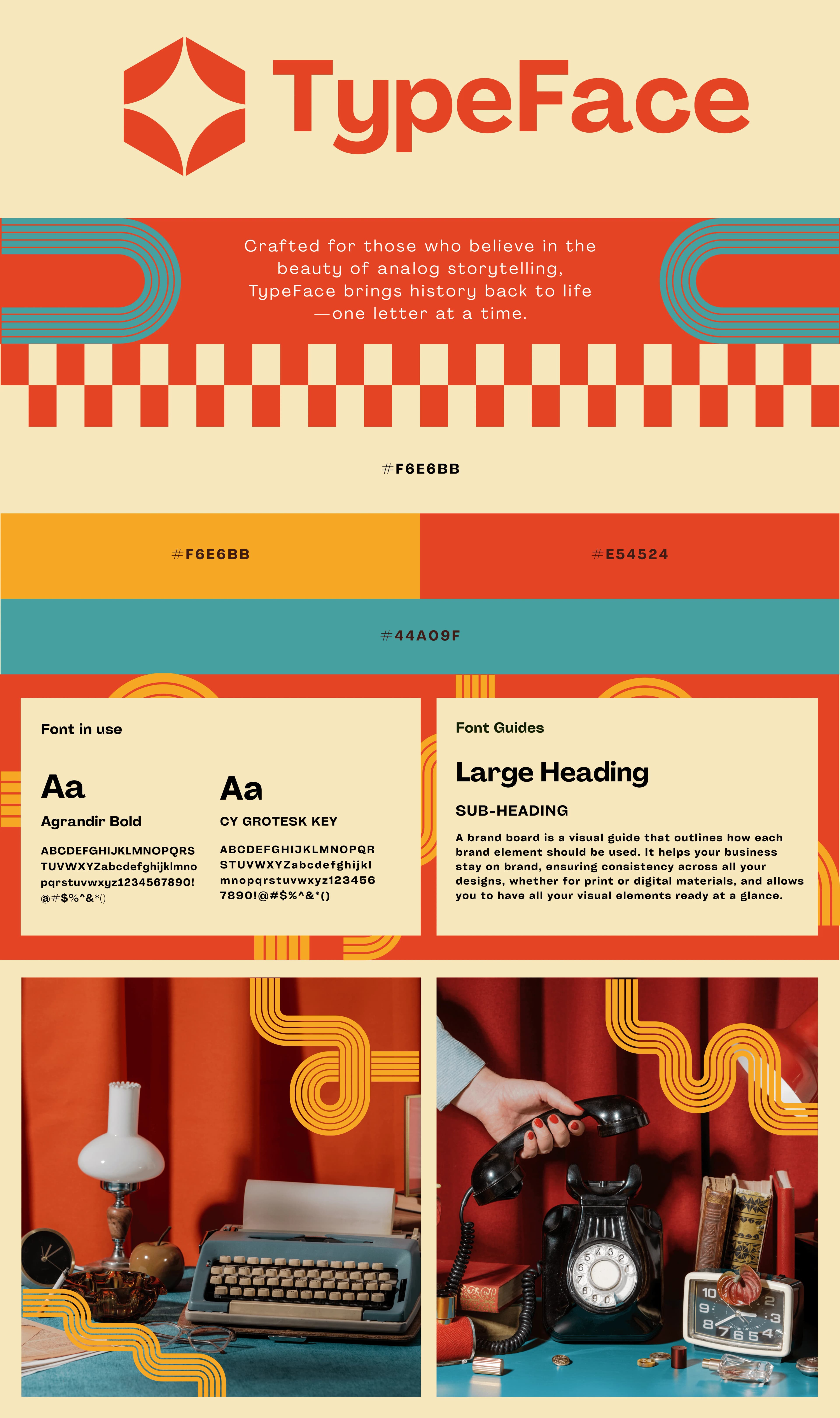
The identity leans on Agrandir Bold for a chunky, retro headline face, balanced with CY Grotesk Key for clean supporting text. A checkerboard motif and looping ribbon graphic, drawn from 60s and 70s print design, give the brand a distinct visual signature that shows up across packaging, social posts, and the website.
Colour does a lot of the work here: a warm cream base, a strong red-orange, and a muted teal accent. The combination feels vintage but not faded, which keeps the brand from reading as costume-y.
Product photography was directed around warm-toned still life scenes: typewriters, rotary phones, glass perfume bottles. These reinforce the "analog storytelling" positioning without needing copy to explain it.
the outcome
TypeFace now has a full visual language that photographs well on shelves and on Instagram alike. The checkerboard and ribbon elements are flexible enough to extend into packaging inserts, stickers, and print ads without a redesign each time.
project gallery
2 assets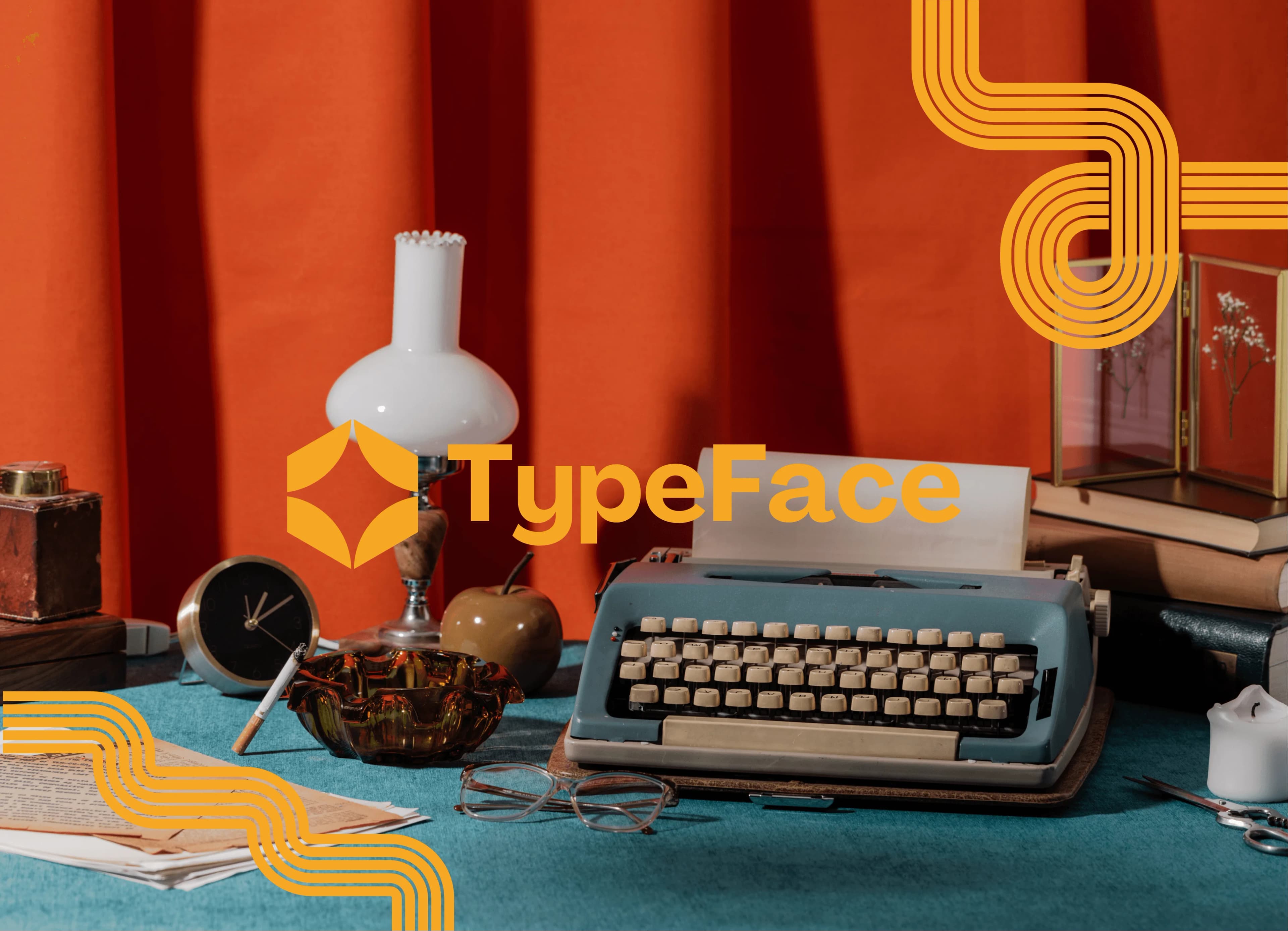
Terra & June
brand identity
ready to build something ambitious?
let's discuss your brand, website, or digital platform and position your business as the obvious choice.