Terra & June
brand identity
the brief
Terra & June is a youthful apparel and eyewear label aimed at a Gen Z audience. The founders wanted something loud, playful, and shareable, a brand that photographs well on hangtags, stickers, and packaging as much as it does on a body.
the approach
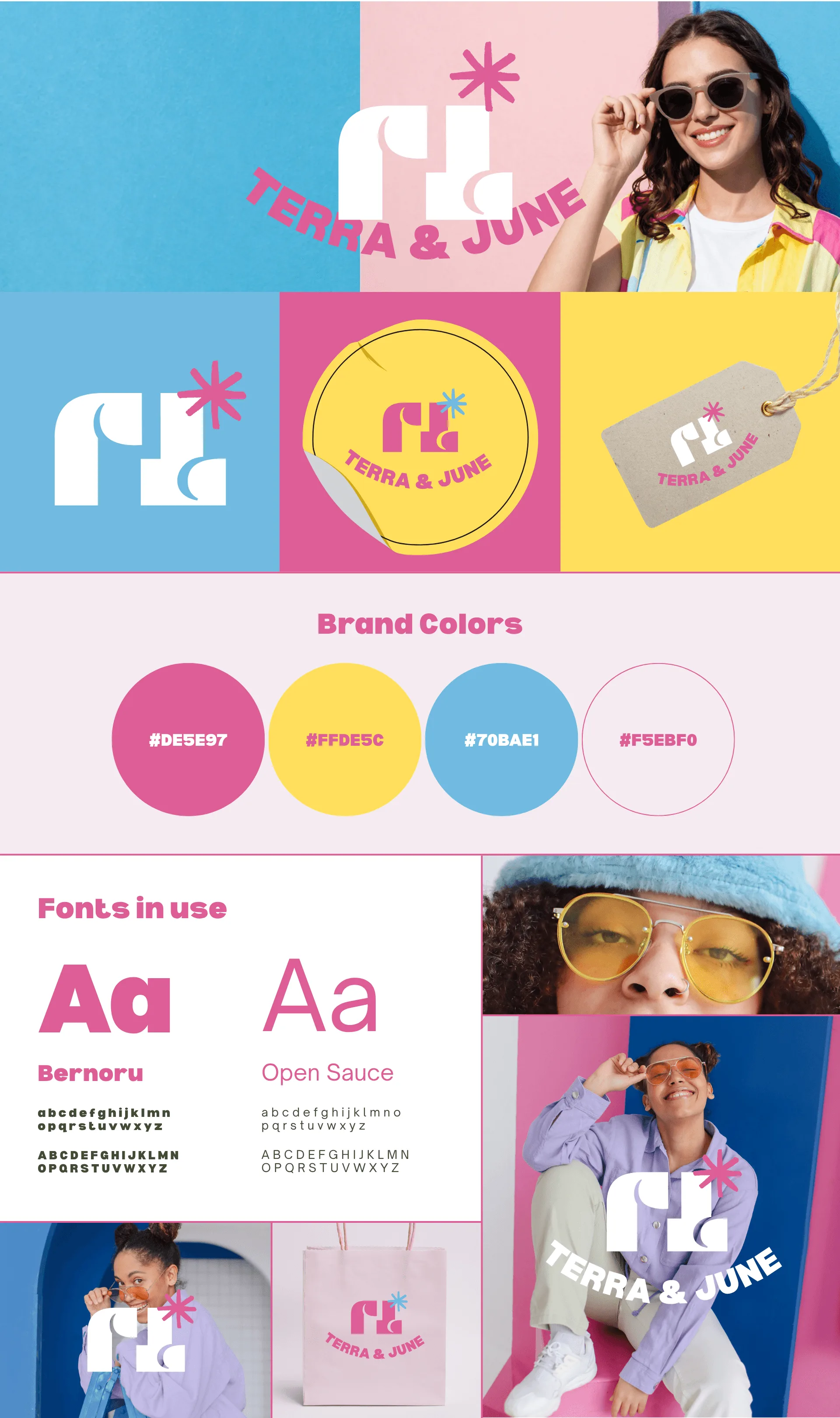
The logo combines two overlapping letterforms into a single mark that works standalone as a sticker or stamp, separate from the wordmark. Bernoru handles the display type with a bouncy, rounded personality, paired with Open Sauce for anything that needs to stay readable at small sizes.
The palette is unapologetically saturated: hot pink, sunshine yellow, and sky blue, set against a soft blush background. A hand-drawn starburst icon shows up throughout as a signature detail, on tags, stickers, and social graphics.
Photography direction leaned into candid, colour-blocked backdrops with models in sunglasses and bright layered outfits, keeping the tone fun rather than polished.
the outcome
The system gives Terra & June a brand kit that scales from a tiny hangtag to a full campaign shoot without losing its identity. The starburst and monogram mark now function as recognizable shorthand for the brand, even without the full wordmark attached.
project gallery
2 assets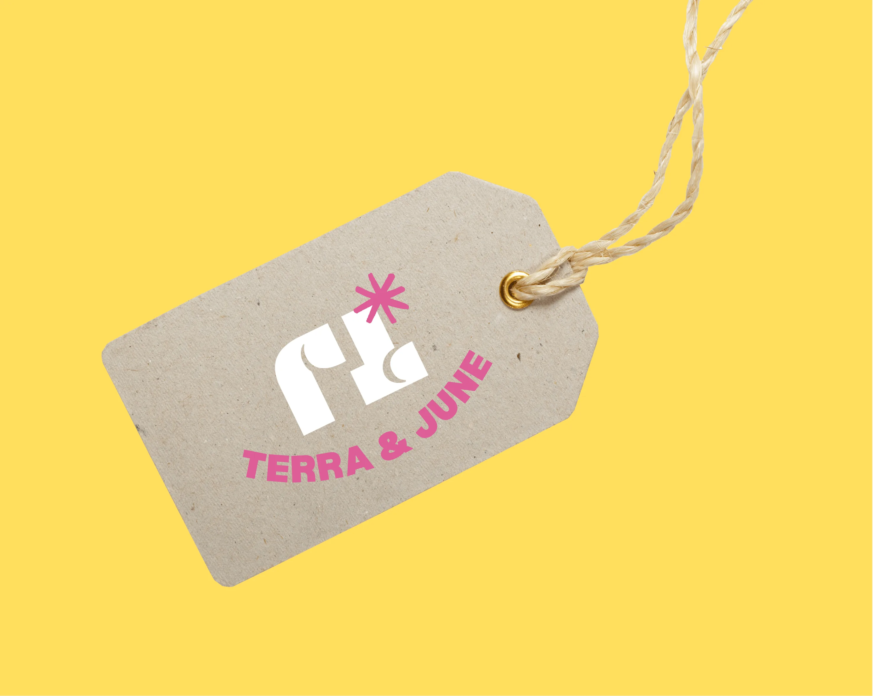
Lorem
brand identity
ready to build something ambitious?
let's discuss your brand, website, or digital platform and position your business as the obvious choice.