Merideth
brand identity
the brief
Merideth needed a brand identity that could carry a furniture and homeware line without falling into the generic "modern minimalist" look every competitor already uses. The founder wanted warmth and character, something that felt handcrafted rather than mass produced.
the approach
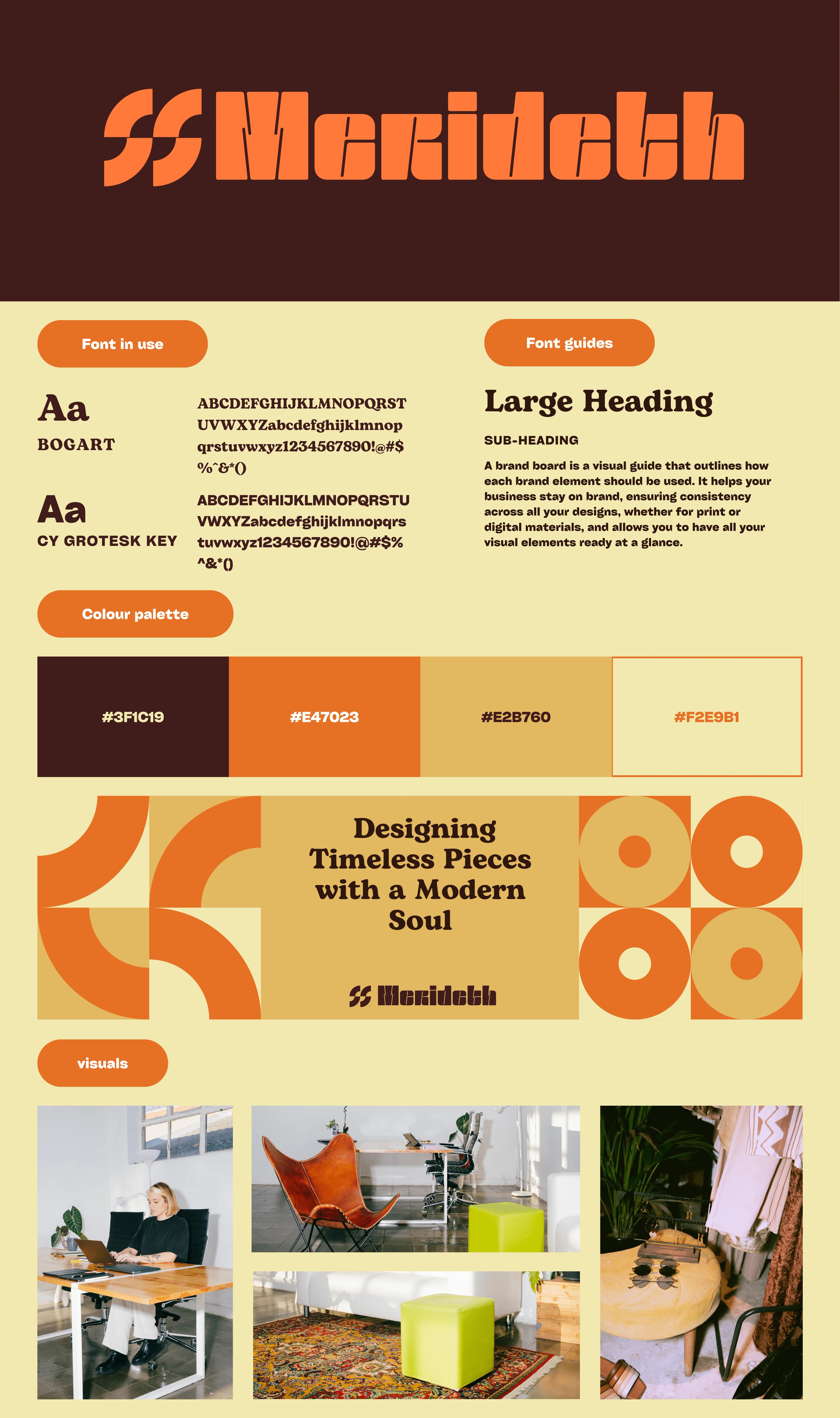
We built the identity around a bold retro wordmark, using Bogart for headlines and CY Grotesk Key for body copy. The pairing gives the brand a confident, slightly rounded voice on the page while staying legible at small sizes for product tags and packaging.
The palette pulls from burnt orange, dark walnut brown, tan, and a warm cream base. It reads as autumnal and grounded, which fits a brand selling pieces meant to live in a home for years, not a season.
Supporting graphics use repeating arc and ring shapes lifted from mid-century furniture silhouettes. These show up as background texture on marketing material without competing with product photography.
the outcome
The final system gives Merideth a look that stands apart from the flat, cool-toned aesthetic common in furniture branding right now. Every asset, from the logo lockup to the Instagram grid, ties back to the same four colours and two typefaces, so the brand stays recognizable across every touchpoint.
project gallery
2 assets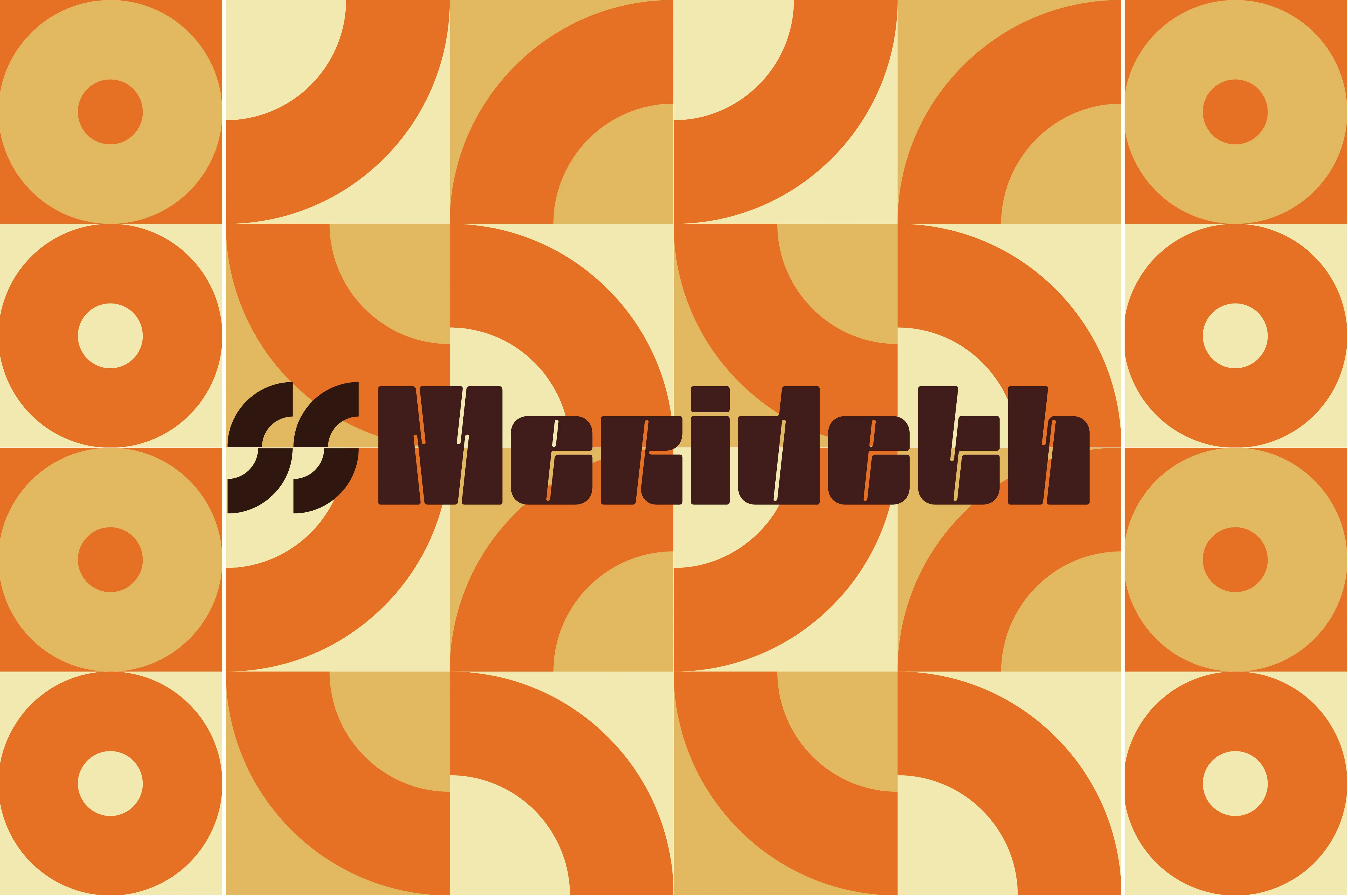
TypeFace
brand identity
ready to build something ambitious?
let's discuss your brand, website, or digital platform and position your business as the obvious choice.